SPACES CRAFTED WITH PASSION
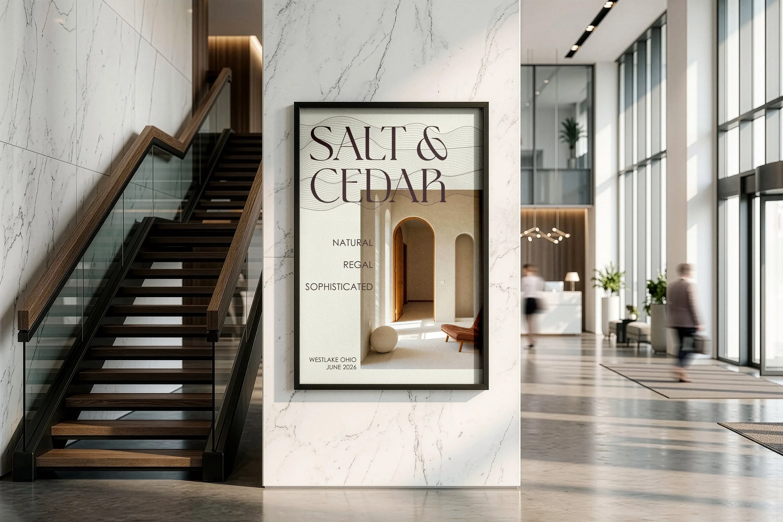
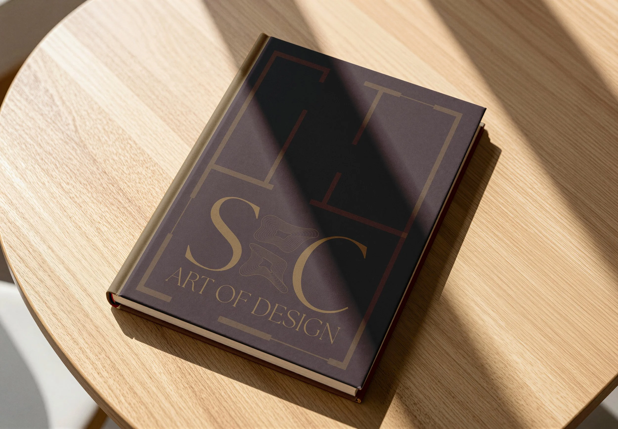
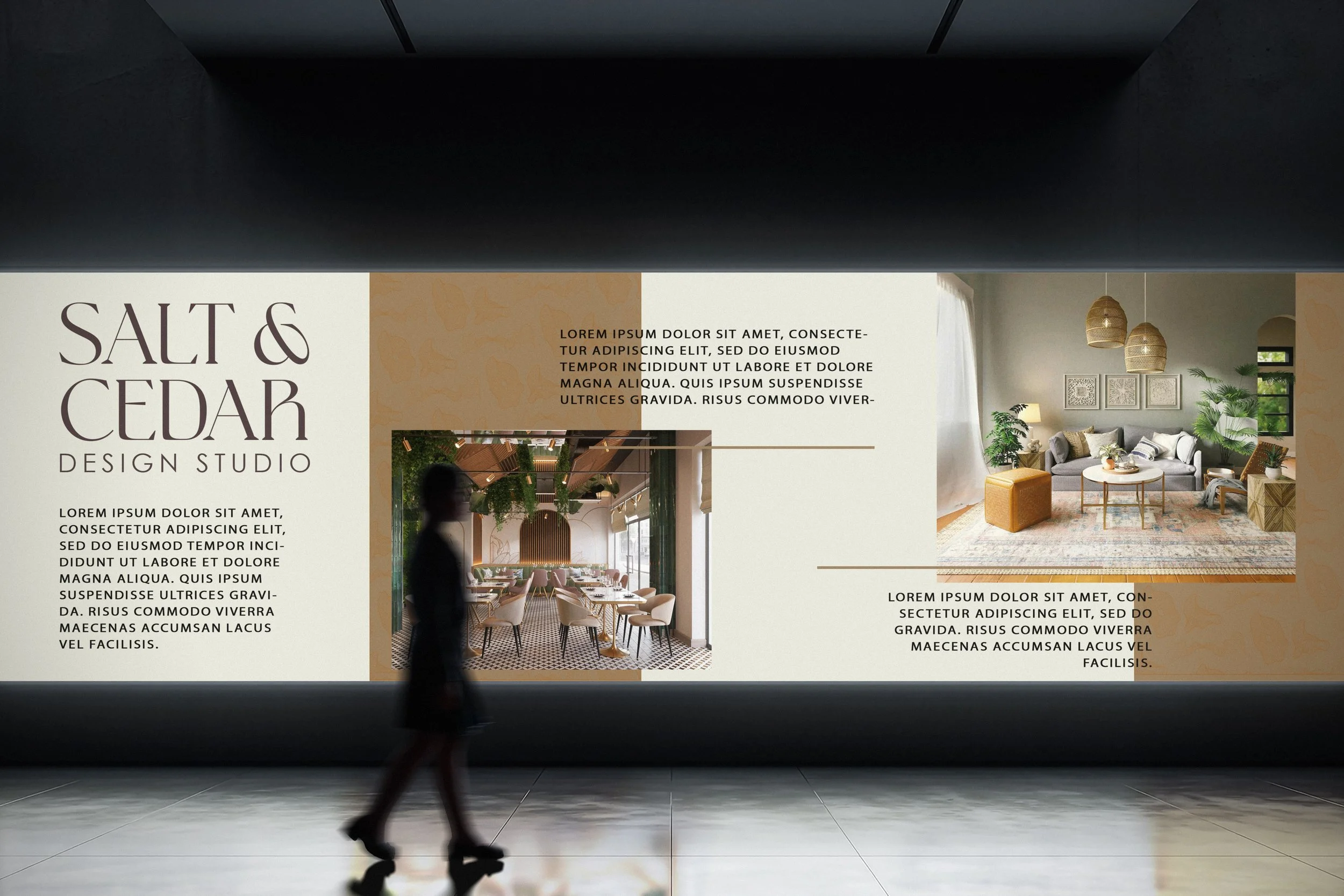
Salt and Cedar are a design studio started by two interior designers who wanted a space to bring their styles together. Think of it as a friendly, down-to-earth introduction to what they do, showing off their shared passion without any unnecessary drama or fuss. The name itself is all about natural textures and finding a good balance. It really highlights their approach to design, which is focused on warmth, simplicity, and making things by hand with a lot of care. This whole setup gives you a great feel for who they are as a brand, helping future clients get a clear picture of their style and the cozy, creative spaces they love to build.
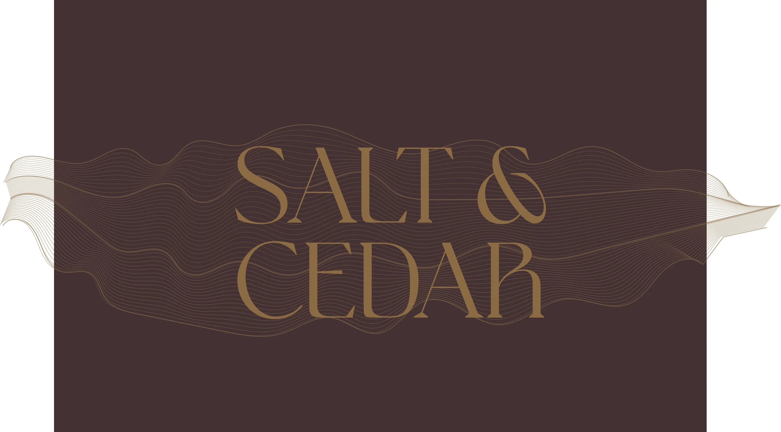
The logo's color palette was carefully chosen to bring the client's exact vision to life, blending an upscale feel with a natural, open look. To give them the structured, regal vibe they asked for, the deep, muted wine brings in a touch of elegant sophistication without feeling stuffy. To balance that richness and keep things grounded, golden oat was added for a warm, earthy, and natural texture. Finally, the off-white ties everything together perfectly, keeping the design clean, bright, and welcoming rather than heavy. It is a purposeful mix that completely delivers on what they wanted something that feels both high-end and down-to-earth.
THE PALETTE’S PURPOSE